

How to Choose Cabinet Colors for Your Kitchen

A cabinet color can look completely different once it moves from a small showroom door sample into your kitchen. Arizona sunlight, existing flooring, countertop veining, ceiling height, and even the direction your windows face all change what you see. That is why how to choose cabinet colors should start with your actual space, not a photo saved from someone else’s remodel.
The right choice does more than set a style. It can make a compact kitchen feel more open, give a large room needed warmth, hide everyday wear, and create a finish that still feels right after the excitement of the remodel is over. A practical selection process helps you get there without guessing.
Start With the Features You Are Not Changing
Before selecting cabinet colors, identify the surfaces that will stay in place or have already been selected. Flooring, backsplash tile, wall color, appliances, and countertops all have undertones that affect your cabinet choice.
Countertops often deserve the most attention because they sit directly against the cabinets. A bright white quartz with cool gray veining can make a warm cream cabinet appear more yellow than expected. On the other hand, a countertop with beige, gold, or brown movement may look disconnected beside a stark cool gray cabinet.
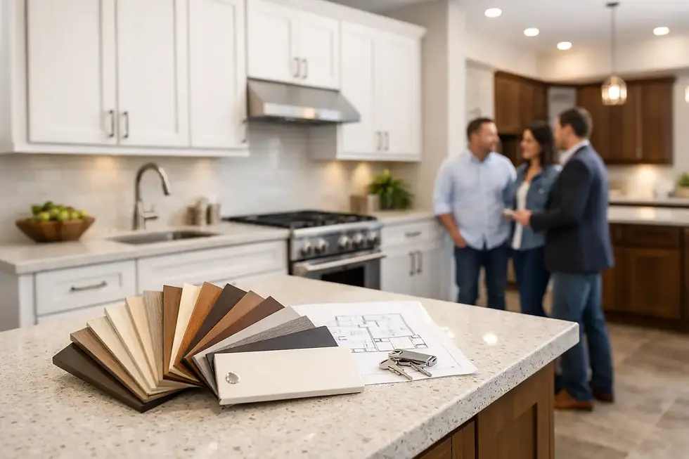
Bring cabinet samples next to the actual countertop and flooring whenever possible. Do not judge one material under showroom lighting alone. Place samples vertically, as cabinet doors will be installed, and view them in morning, afternoon, and evening light. This simple step catches many color mismatches before they become an expensive change order.
If you are replacing everything, choose the cabinet color and countertop together. Neither selection should be treated as an afterthought. The two materials need to share a temperature - warm, cool, or neutral - even when they provide contrast.
Evaluate Your Kitchen’s Natural and Artificial Light
Phoenix-area homes can receive intense direct sun, particularly in kitchens with large west- or south-facing windows. That light can make pale colors look nearly white, deepen the appearance of dark finishes, and reveal undertones you may not notice indoors at first.
White cabinets remain a strong choice for kitchens with limited natural light. They reflect available light and give the room a clean, open appearance. But “white” is not one universal color. Some whites lean crisp blue-gray, while others have cream, ivory, or soft beige undertones. A cool white can feel fresh beside stainless steel and gray-veined quartz. A warmer white usually works better with travertine, wood-look flooring, and warmer countertop selections.
Dark cabinets create depth and can look especially polished in a kitchen with generous windows, high ceilings, or an open floor plan. Navy, charcoal, black, and deep stained wood can ground a room beautifully. The trade-off is that dark doors show dust, fingerprints, and scratches more readily, especially around frequently used drawers and lower cabinets.
Artificial lighting matters just as much after sunset. Warm bulbs can pull yellow or cream tones from white cabinetry, while cooler bulbs can make some grays appear flat or blue. Review samples under the lighting you plan to use over the island, under upper cabinets, and throughout the main kitchen.
How to Choose Cabinet Colors That Fit the Room Size
Room size does not dictate one correct cabinet color, but it should influence how you use contrast. Smaller kitchens usually benefit from lighter main cabinets, especially when upper cabinets reach the ceiling or cover a large amount of wall space. Soft white, light greige, pale oak, and warm light gray can provide visual breathing room without making the kitchen feel sterile.
That does not mean a small kitchen must be all white. A darker island, a wood-tone base cabinet run, or a contrasting pantry wall can add personality while preserving an open feel. Keeping the perimeter cabinets lighter and using a darker accent on one defined area is often easier to live with than covering the entire room in a deep finish.
In a larger kitchen, darker colors and two-tone combinations have more room to work. A deep green island with off-white perimeter cabinets, for example, can create a tailored look without overwhelming the space. Large rooms also support more contrast between cabinets and countertops, provided the flooring and backsplash tie the palette together.
Ceiling height plays a role, too. Dark upper cabinets can visually lower a ceiling in a compact room. If you prefer a deeper color, consider using it on base cabinets or an island and selecting lighter uppers.
Choose a Color That Matches How You Live
A cabinet finish needs to work on a busy Tuesday morning, not just look good on installation day. Families with children, frequent cooks, and pet owners may prefer mid-tone colors, wood grains, or painted finishes that are more forgiving of daily use than pure white or near-black cabinetry.
Here are four practical questions to ask before committing to a color:
Will this finish show fingerprints near the refrigerator, trash pullout, and often-used drawers?
Does it work with the amount of cleaning and maintenance you want to take on?
Will it still fit if you repaint the walls or change bar stools later?
Is the color something you genuinely enjoy, or is it only appealing because it is popular right now?
Neutral does not have to mean bland. Taupe, mushroom, soft gray-green, light oak, and medium walnut can provide lasting character while leaving room to update decor over time. More distinctive colors, such as saturated navy or forest green, often work best on an island, beverage station, or lower cabinet run where they create impact without controlling the entire kitchen.
Use Contrast With a Clear Plan
The strongest kitchen color schemes usually have a reason behind them. Contrast can define an island, separate a working zone, or balance a bright countertop. It should not feel like every element was selected independently.
For a calm, cohesive result, pair cabinets and countertops with modest contrast. Warm white cabinets with a soft beige or lightly veined quartz countertop are a reliable example. For a more defined look, use a darker island against light perimeter cabinets, then repeat the island color in a few details such as open shelving, stools, or a range hood accent.
Be careful with high-contrast combinations when several other finishes are competing for attention. Black cabinets, dramatic marble-look quartz, patterned backsplash tile, bold flooring, and decorative hardware can create visual noise if all appear in the same sightline. In that situation, let one material be the focal point and keep the others more restrained.
Wood cabinetry brings a different kind of contrast. Natural white oak, walnut, and other grain-forward finishes add warmth that painted cabinets cannot fully replicate. The key is choosing a stain or wood tone that coordinates with the floor without matching it too closely. Floors and cabinets that are almost, but not quite, the same wood color often look accidental. A deliberate difference in tone or species generally looks more finished.
Consider Door Style, Hardware, and Finish Together
Cabinet color never stands alone. The door profile changes how it reads. A simple shaker door makes a painted color feel clean and versatile. A slim modern slab door can make the same color feel more contemporary. A raised-panel door adds shadow lines that can make darker paint colors appear richer.
Hardware also affects the final result. Matte black pulls sharpen the look of white, oak, and gray cabinets. Brushed nickel stays understated and flexible. Warm brass can complement cream, green, navy, and natural wood finishes, but it should be repeated elsewhere in the room so it feels intentional.
Ask to see the actual door style in your selected color, not only a flat swatch. Painted finishes can vary across door profiles because edges, grooves, and recessed panels catch light differently. This is especially relevant with white, gray, and blue-gray colors, where undertones are more noticeable.
Make the Decision With Samples and a 3D Layout
The most reliable way to avoid regret is to review the entire combination before ordering: cabinet door, countertop sample, backsplash, flooring, wall paint, and hardware. A 3D layout adds another layer of confidence because it shows where colors will appear across the room - on tall pantry cabinets, an island, upper cabinets, and base cabinets.
At Croc Kitchen Cabinets, that planning process can connect on-site measurements with cabinet color selection, countertop choices, and a practical 3D design before delivery and professional installation. It is a useful safeguard for homeowners who can picture individual materials but want to see how the complete kitchen will work together.
Do not rush a color choice because a sample looks good by itself. Take it home, place it beside the materials in your kitchen, and let it sit there for a few days. The cabinet color that continues to feel balanced in your real light and daily routine is usually the one worth building the room around.


Comments